
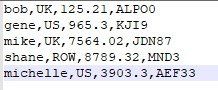
Add some sparkle to your Excel tables
john lilleystone • March 1, 2020
Make your tables in Excel more interesting and informative by using Sparklines.
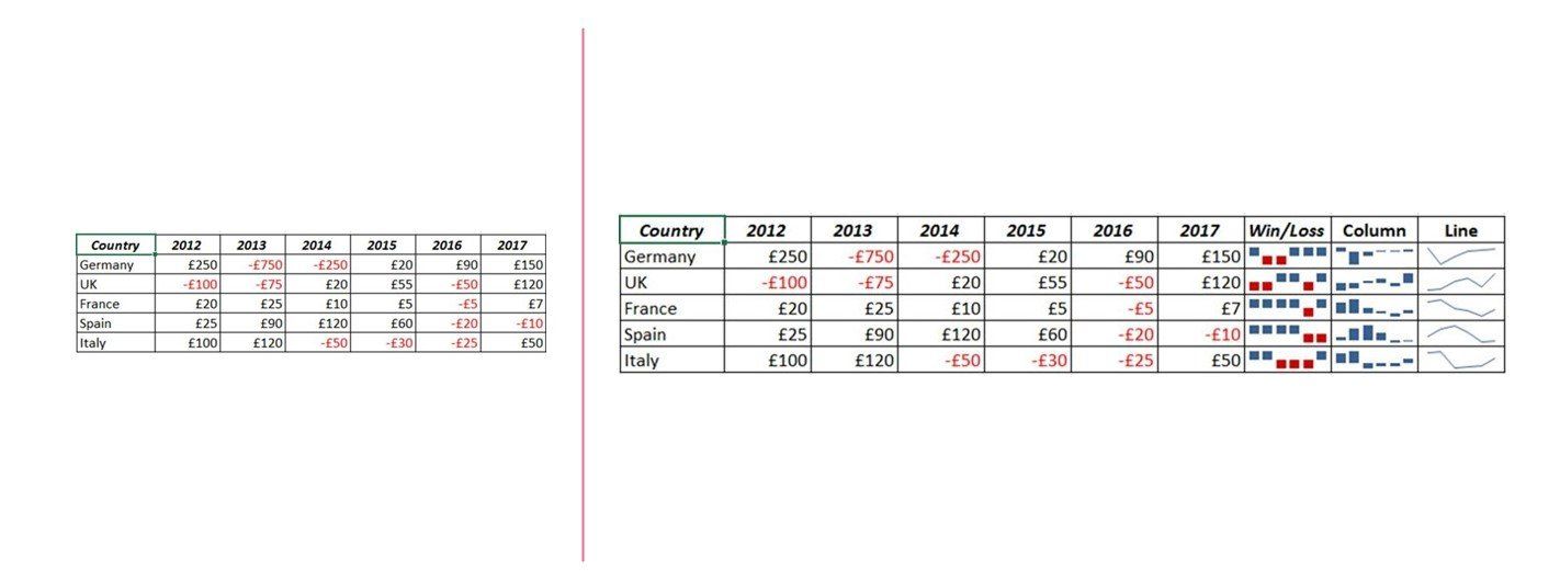
In the above example, the table on the left is just boring old rows and columns of numbers. The table on the right has been jazzed up a bit by using Sparklines.
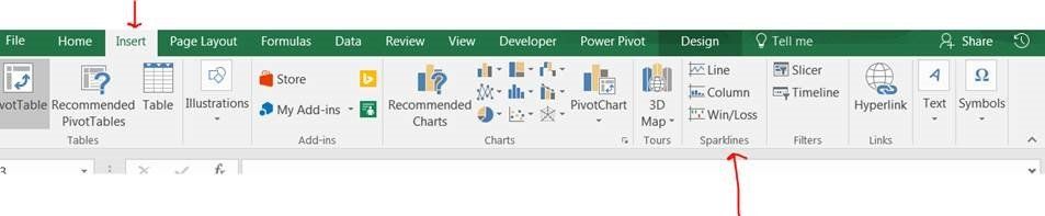
Position your cursor in the cell to the right of the last value in the row and from the Insert menu on the Ribbon select the Sparkline style you want to display.
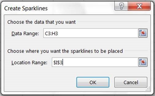
You will be prompted for two pieces of information. 1 - The data range (highlight the start and endpoint in the row) 2 - where you want to display the graphic (which should default to where you positioned your cursor).
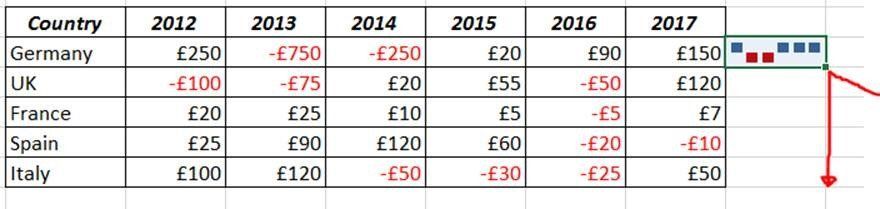
Then just drag the square down to the other rows to copy the format.
This kind of graphic is useful for doing scorecard type analysis. As your numbers change in the data area the sparklines will adjust accordingly.


Replace ugly Excel errors returned by a formula with something more appropriate and pleasing to the eye.


Use the RANDBETWEEN function in Excel to randomly generate numbers between a specified upper and lower threshold.
Don't waste time manually editing queries to move the date period on one month. This blog explains how to use DATEADD to dynamically shift the dates on one month on each refresh
Import text files into Excel and use the Text to Columns wizard to separate the data into columns

Extract values or strings from a cell from either the left, middle or right part of the cell
